That’s NEAT

idea363_1_2_sl

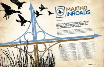
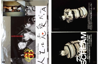
I found this page interesting because the images are portrayed horizontally plus are overlapping; it brings a collage feel to the layout.

365_80s-3-reo-1_sl

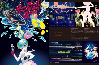
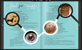
I found the images on this layout beautifully abstract and organized; the somewhat circular piece on the right hand corner caught my eye.

img_02

The position of the images bring a dynamic feel to the layout, since all of them are at the same angle it brings the composition together.


Uhh..maybe these

The following are three layouts that caught my eye; accompanied by colors that I think will help attract the reader. All 3 consist of black because the concept of “darkness” plays  huge role throughout the story; while the colors of red, blue and yellow come secondary but serve as a purpose of contrast. The first layout provides a perfect setup for the headline “Whatever Happened to Him?”; while the second and third layout can be seen as a timeline.

First Layout

palette564eb212c22c5

Color 1

Second Layout

palette564eb09bb7cbf

Color 2

Third Layout

palette564eaf90267d9

Color 3

Three Types of Entertainment

Neo Magazine

Entertainment Magazine

Game Informer Magazine

Three publications my story could be published are Neo, Entertainment Weekly, and Game Informer; since my story is fabricated on Kingdom Hearts being a movie rather than a video game it will take ideas from all three. Neo provides previews, reviews and guides for the latest Anime, Manga, Asian movies and games; while Game Informer highly focuses on video games. Entertainment Weekly concentrates on critical reviews of film, television, and popular culture which I hope to provide in the story of kingdom hearts by providing Sora with a back story on what happened when he became a “heartless”.

A Little Back Story

Kingdom Hearts Cover

Kingdom Hearts starts with the main character, Sora, who wants to see new lands with his two friends Riku and Kairi. When the heartless enter their world the trio get separated and are found in different worlds; all based on Disney lands such as Halloween town from The Nightmare Before Christmas and Agrabah from Aladdin. Throughout the series Sora is looking for his companions with the help of Donald Duck and Goofy; it’s not until Kingdom Hearts II that all three are together but are now mixed in a liminal fantasy, in which the three are partaking in a Keyblade war that sets up the third installment of the Kingdom Hearts saga.

I’ts Been 10 Years!!!!

Who is he?

Who is he?

I selected the Entertainment magazine and will cover the comeback of Kingdom Hearts main character, Sora. I will provide a timeline of the series and all it’s extremely unnecessary side stories; plus adding a creative background to what Sora was doing during his 10ish years of hiatus. For those who don’t know, Kingdom Hearts is a video game, released in 2002, that is a collaboration between Disney and Square Enix and basically it’s freaking awesome.

Comparing

What's wrong with this picture

What’s wrong with this picture?

Fedra Sans has similar features to other Humanist Sans Serif typefaces, such as Calibri and Gill Sans but with a keen eye you could tell the differences. For example. Callibri’s lower case “f” doesn’t have the same point of intersection as in Fedra sans and the counter forms in Fedra Sans is more “D-bowl” shaped while Calibri is elliptical. A huge difference in both type faces is their lowercase letter “g”; while Gill Sans has two bowls one on top of the other Fedra sans has only one and has a line descender

Serif, or Sans Serif? That’s the question.

Fedra Sans Serif

Fedra sans is classified as a sans serif because it doesn’t have any serifs or thick to thin lines as serif type styles do. The one I think Fedra Sans fits into best is the Geometric sans serif since it was designed in the 1980’s and due to its symmetrical style. Fedra sans has many variations, in which it could fall in the Humanist sans serif; however the majority of the type family stays in the Geometric Sans Serif classification.

What’s it good for?

Artist’s catalog using a custom version of Fedra Sans

Fedra Sans was created to be useful on paper and on the computer screen; and to be consistent across all computer platforms. The font data was stolen in early development so the design was re-examined, thus bringing out the newer version which we know today as being versatile, offering a wider range of fonts and becoming a more flexible type family. Fedra Sans provides a clear and legible font that is used in many ways.

.

Peter Bil’ak Bio

Peter Bil’ak

Peter Bil’ak was born in 1973 in Czechoslovakia and currently resides and works in The Hugue, Netherlands. He works in the field of editorial, graphic and type design; mostly known for being the head of the type foundry Typotheque. He currently writes for various design related magazines and in 2000, founded, edited, and designed art & design journal DOT DOT DOT.

Fedra Sans

Fedra Sans

The typeface, Fedra Sans, humanizes the communicated message and adds simple, informal elegance. It was designed by Peter Bil’ak, a Czechoslovakian residing in the Netherlands. He created Fedra Sans in 2001 and the fonts are still continuously being updated.