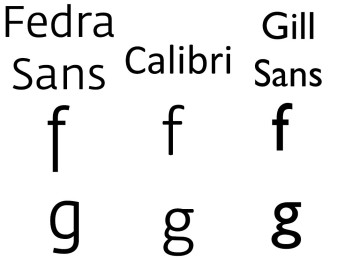
Fedra Sans has similar features to other Humanist Sans Serif typefaces, such as Calibri and Gill Sans but with a keen eye you could tell the differences. For example. Callibri’s lower case “f” doesn’t have the same point of intersection as in Fedra sans and the counter forms in Fedra Sans is more “D-bowl” shaped while Calibri is elliptical. A huge difference in both type faces is their lowercase letter “g”; while Gill Sans has two bowls one on top of the other Fedra sans has only one and has a line descender
Ahntonee13

